Great work, I think it's very nice. But, I have to agree with ThomasCook, since this site is about aviation in general. But, I like to say it again: you're work is simply great
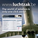
I agree with ThomasCook and the others: a very nice banner but It could be more colorful It's a pity that the banner is also lost between these 2 gray option-bars. But does the banner needs to be that small? Why don't you make a dynamic banner = one that depends on the window-size (resolution) (well, Bart will have to program a little bit)? You still have so much white space that you can use: more belgian airliners, a bigger www.luchtzak.be, ... but keep this style and colors!!! Very nice job.
Im not sure if he does banners but the message at the bottom of the page reads. . .
" As dedicated aviation enthusiasts, we're always interested in new opportunities. If you'd like to see a new airline image design, or have any suggestions - please contact us and we'll respond to your request as soon as possible "
He has created some very nice aviation material from airline tickets, corporate logos and new colour schemes for aircraft . . . So maybe it would be an idea to send him a message
Airborne has done a great job. I think he should co-ordinate with Bart and gang to see what suits general requirements best and keeps LUCHTZAK rocking.
blackhawk wrote:I agree with ThomasCook and the others: a very nice banner but It could be more colorful It's a pity that the banner is also lost between these 2 gray option-bars. But does the banner needs to be that small? Why don't you make a dynamic banner = one that depends on the window-size (resolution) (well, Bart will have to program a little bit)? You still have so much white space that you can use: more belgian airliners, a bigger www.luchtzak.be, ... but keep this style and colors!!! Very nice job.
To be honest I think it would be better to have a banner that isn't too colourfull. The one that Airborne made is just perfect concerning the colours.
In my opinion the size is ok. Don't forget it shouldn't be too big. But I would position it in the middle of the frontpage and not in the left corner. (a bit like on A.net if you see what I mean).
Blackhawk is using size 1280 * xx pixels, normally people use size 1024*860. Then the logo comes out better on that size. But I can agree to move the logo a little bit to the middle. I am waiting for a reply from Airborne, first I need to clear out some things before we go ahead
I think I should have used another word instead of "colorful". What I wanted to say is that there is only 1 airline carrier visible, one with blue and white . There is also a red one, one with a little bit yellow, a blue one, ... But I agree that these colors are perfect
Now that I see the banner on the page I still have some remarks (constructive ones of course )
First of all, it would maybe be better if it's a little bigger after all. Like Blackhawk said it. Or at least It would be better if there isn't that white space at the left of the banner.
Secondly I would also try to remove both grey bars on the top of the page. But I don't know how to improve it. The best would be to completely remove the bar at the top and put all the buttons at anothe place.
First of all I would like to thank Airborne for this very innovative, crisp and clear design. It makes the entire website even more professional! Besides after 10.000.000 pageviews we can use a fresh wind
I have read all above feedbacks and comments and I could agree that the tool-bar is a little out-dated, therefor I reprogrammed the design. Note that the design for members is a little different than for non-members.
I am looking forward to your comments and feedback, together we can keep www.luchtzak.be the best place on the www (at least aviation related )