Brussels Airlines will add another dot tho his logo. They are doing this because the current logo has 13 dots thet together form the B. But they got a lot of reactions by superstitious people, especially from the States and Italy.
So already a changed loge and the airline is not even officialy started to fly under its new name
My god , I guess I will never understand how stupid or crazy some people even CAN be... anyway. When changing the logo , they might as well add some more color on the fuselage :P who knows.
Anyway , is there anything known about the change of the airline code , currently 'SN' or the 'callsign' (Brussels?).
Who on earth counts the number of globes on an aircraft's tail to look for bad luck??? Americans and Italians apparently. If you look hard enough, you'll find somethig that's present on an aircraft thirtheen times...
*frustration mode off*
@Bruspotter: have a look on Ba's website. You'll notice that all the flights have a SN code. Callsign hasn't been changed yet.
Besides, here's an intresting idea. Ba registered the new logo at the copyright bureau with 13 spheres. So the 14-sphere logo isn't copyright protected?
Cartman wrote:Besides, here's an intresting idea. Ba registered the new logo at the copyright bureau with 13 spheres. So the 14-sphere logo isn't copyright protected?
They will probably registred it by now.
If not someone can register it and sell it to BA to earn some mony 8)
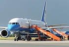
If you have a look at the 3 737s which have currently been repainted, you'll see 2 of them already have the 14th dot and quite frankly, it looks better, because now the logo goes almost all the way up to the tip of the tail, whereas before, it ended a bit too low (to my taste).
I suppose they've kept it 'quiet' till the new logo was registered?
just by the way, not counting the number of bubbles on the tail, but does anybody else than me can see "a bit" of similarity between the new ba logo and this special livery of a hlx plane for Hanover Airport ??
euroflyer wrote:just by the way, not counting the number of bubbles on the tail, but does anybody else than me can see "a bit" of similarity between the new ba logo and this special livery of a hlx plane for Hanover Airport ??
I think they both stand for runway lights, that's the reason for their similarity.
Could this give copyright problems? I suppose the Brussels Airlines logo designers know the rules.
I don't think so. It might look a bit alike but to my knowledge in the law system it goes like this:
If it isn't exactly the same or almost the same and there are no hard evidences that they might have stolen their idea , than you stand nowere and besides , the other one is not guilty than.
Yes maybe that would have been interesting , maybe they could have made a circle of red dots , TOTALLY just alike the EU-flag anyway what I DO like about the new logo is that it is (even a small bit) bigger. The more colour , the better.
Saw today my first A319-100 of Brussels Airlines , just missed it but I must say I already liked it from far.
This only shows how uncertain BruAir is about its own future. One dot more or less would not make any difference to a management with a strong vision.
Oh come on. The only thing it shows is common sense. It would be an utterly stupid and pigheaded decision if they didn't make this easy change (especially so early in the rebranding process that it'll cost hardly anything to do), and potentially turn away the business of those superstitious flyers. No matter how ridiculous we may find their superstitions, their money is just as good as that of anyone else.
Last edited by teach on 24 Dec 2006, 13:50, edited 1 time in total.