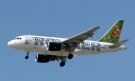
It seems that Lan chile has decided to follow todays trend, by writing in very big letters LAN on the body. Personally I found the older liverey nicer. It's a shame they are changing
I think waves in plane liveries is fashionable.
If you look to the new PIA livery, EL AL...etc.
You can notice waves in their livery. I like that, it shows a very modern and free look.
Not bad, but they should have kept the same shade of blue, this one is to dark. There's allso to much wite in the front, and the letters should be a bit less wide...
I don't like the name LAN though, LanChile sounded much nicer. LAN does sounds more global, and that's the intention, but I still don't like it...
Very very nice livery, this is what I ment with fresh and bright a little while ago
Good thing is they are going to fly directly from Spain (MAD?) to Lima and that is good news for me since I need cheaper options then KLM to get there. IB is having nice offers and I know LAN is already very competitive on his prices, it's going to be interested for me
I personnally love both the old and the latest liveries. The previous one was extremely classy albeit kind of stiff by today's standards. It was one of the first liveries of the 90s to boast striking yet smart colors. The new livery is much more modern... maybe slightly less classy though.


I think we can all agree that this one was horrible: http://www.airliners.net/open.file/544120/L/